The ChromaTravel Index: The official ranking of the world’s most colourful destinations

Have you ever felt instantly uplifted just by looking at a bright blue sky or wandering through a street bursting with colourful buildings? You’re not alone. A growing trend called “ChromaTravel” is all about just that, choosing travel destinations based on their vibrant, mood-boosting palettes.
According to globally renowned applied colour psychology expert Karen Haller, it’s grounded in psychological science. “The colours in our environment have a powerful effect on our psychological wellbeing. Travelling to visually rich destinations can lift our mood, change how we feel and respond, and make our experiences even more memorable.”
To dig deeper into this trend, our data team created a ChromaTravel Index, a ranking of the world’s most colourful travel hotspots. Using daylight-only images from trusted public sources, each destination was analysed for things like saturation, vibrancy, and hue variation (the subtle shifts in colour, like turquoise to teal). Backed by Haller’s expertise, every spot was given a score out of 100 based on how visually vivid it really is.
So, whether you're planning your next getaway or just daydreaming, these colourful escapes might be just what your mood needs.
The ChromaTravel Index: The world’s most colourful travel hotspots
Rank | Destination | Country | Score /100 |
1 | Chefchaouen | Morocco | 73.09 |
2 | Nyhavn, Copenhagen | Denmark | 72.88 |
3 | Bo Kaap, Cape Town | South Africa | 72.05 |
4 | Balat, Istanbul Province | Turkey | 70.94 |
5 | Burano | Italy | 70.42 |
6 | Hoi An | Vietnam | 68.56 |
7 | Kampung, Warna-Warni, Jodipan | Indonesia | 68.16 |
8 | Antigua | Guatemala | 67.25 |
9 | Jaipur | India | 66.90 |
10 | La Boca, Buenos Aires | Argentina | 66.52 |
11 | Tobermory, Mull | Scotland | 65.06 |
12 | Menton, Provence-Alpes-Côte d'Azur | France | 64.87 |
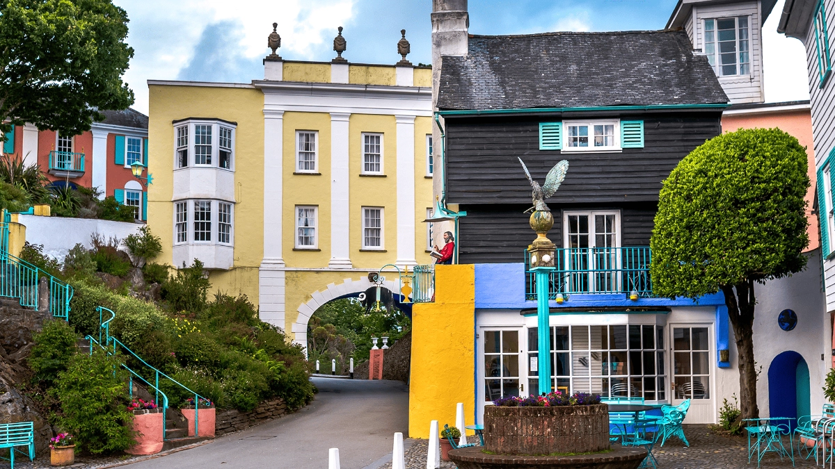
13 | Portmeirion, Gwyned | Wales | 64.16 |
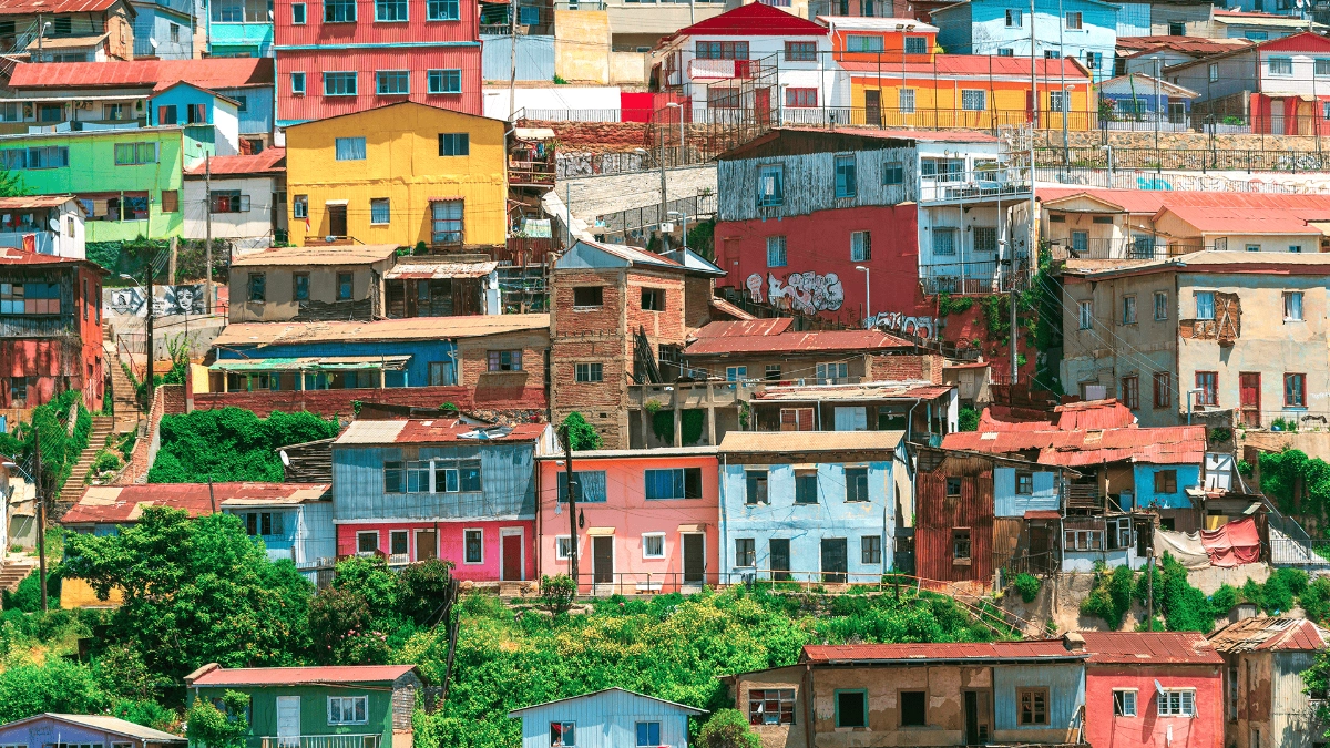
14 | Valparaiso | Chile | 62.09 |
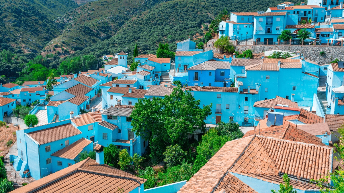
15 | Juzcar, Málaga | Spain | 61.63 |
16 | Gamecheon, Busan | South Korea | 60.50 |
17 | Guanajuato | Mexico | 60.18 |
18 | Little India | Singapore | 58.31 |
19 | Brighton | England | 58.15 |
20 | Guatape | Colombia | 57.96 |
21 | Porto | Portugal | 57.94 |
22 | Rio de Janeiro | Brazil | 57.53 |
23 | Wroclaw | Poland | 57.31 |
24 | Gamla Stan, Stockholm | Sweden | 55.56 |
25 | Havana | Cuba | 54.34 |
26 | Willemstad | Curaçao | 53.30 |
A breakdown of the top 15 most colourful destinations
From the electric blues of Júzcar to the warm, earthy tones of Antigua, some places don’t just pop with colour, they connect with us on a deeper level. Being surrounded by colour-rich environments can lift our spirits, awaken our senses, and help us feel more present and connected to the moment. It’s one of the reasons these destinations feel so memorable long after we return home.
To help unpack why these places have such an impact, colour psychology expert Karen Haller, has shared her insights on each of the top 15 destinations. Her commentary reveals how specific hue combinations can influence everything from how we feel to how we connect with our surroundings.
If you’re tempted to start booking your next trip for a burst of vibrancy, don’t forget the practical yet important planning, like buying your travel insurance as soon as you book your trip. It's a small step that can help keep your next adventure worry-free.
Here’s your kaleidoscopic travel inspiration of what the world has to offer...
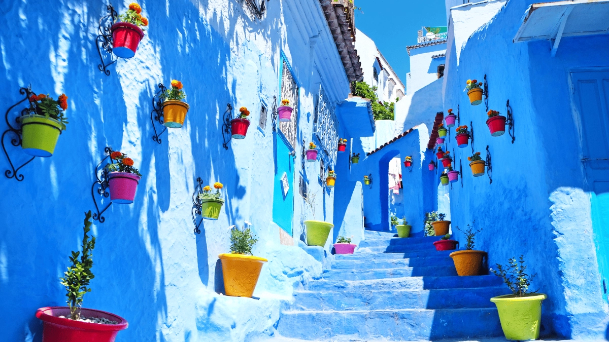
1. Chefchaouen, Morocco (73.09/100)
Dominant colours: Cobalt Blue, Azure, Cerulean, Sky Blue
Chefchaouen, nicknamed the ‘Blue City’, is famous for its light blue, sky-coloured streets and buildings that seem to wrap the town in calm. The soft, consistent use of blue creates a peaceful atmosphere that many visitors find instantly mentally soothing. In colour psychology, light blue is known to promote relaxation and a sense of quiet, which may explain why wandering these blue-washed lanes can feel almost meditative.
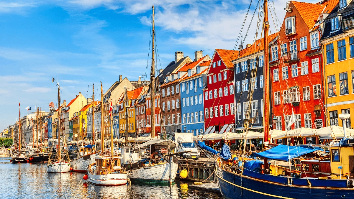
2. Nyhavn, Denmark (72.88/100)
Dominant colours: Sunny Yellow, Warm Orange, Deep Red, Royal Blue, Forest Green
Nyhavn, Copenhagen’s famous harbour district, is instantly recognisable for its row of brightly painted waterfront houses. Their bold, cheerful colours bring a sense of warmth and joy that can lift your spirits, especially in the darker months. In colour psychology, saturated hues like these can help energise and uplift. On a more personal level, the playful palette may stir nostalgia, evoking childhood memories or the charm of a storybook scene. It is no surprise that Nyhavn remains one of the city’s most beloved and photographed spots.
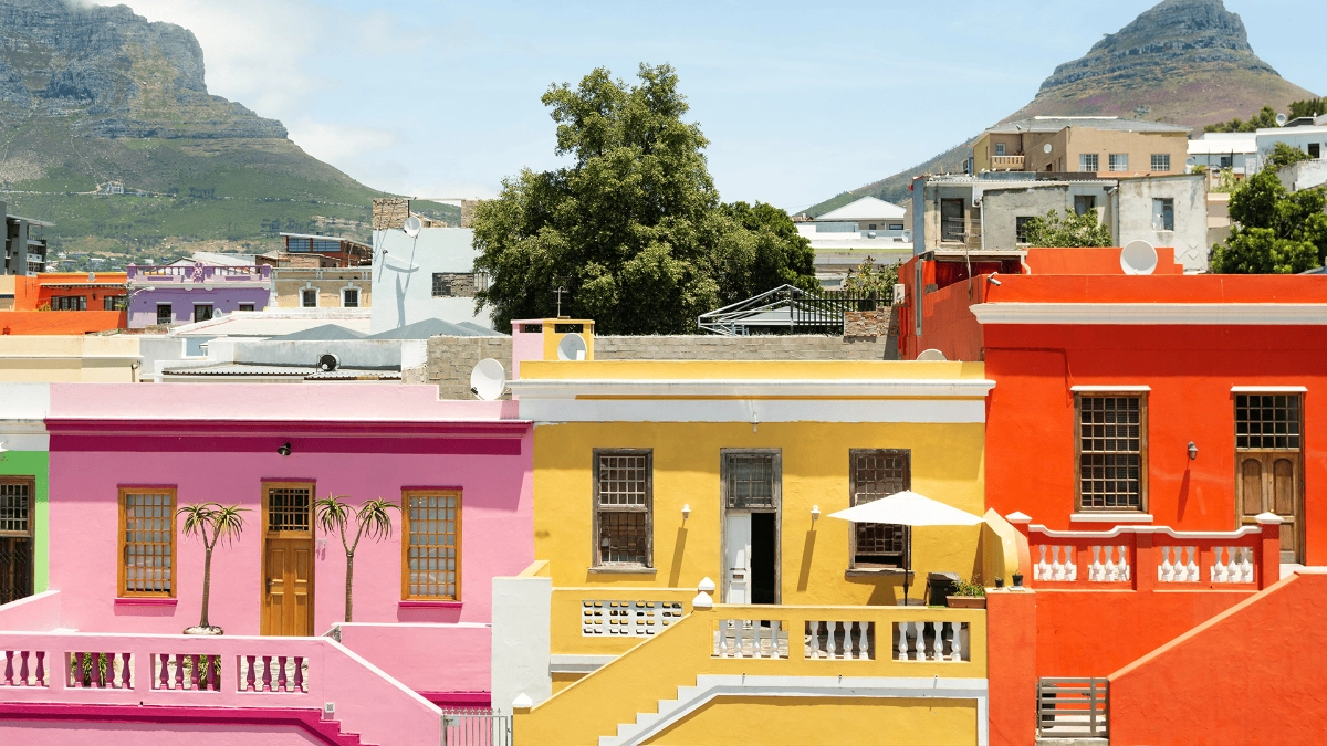
3. Bo Kaap, Cape Town, South Africa (72.05/100)
Dominant colours: Fuchsia Pink, Turquoise Blue, Lime Green, Sunset Orange, Magenta
Bo-Kaap’s vividly painted houses create an atmosphere bursting with energy and joy. The mix of bold colours like orange, pink, turquoise, yellow, and lime green makes the neighbourhood feel alive and full of personality. In colour psychology, vibrant hues can help stimulate and energise the senses. While the emotional response is personal, such a rich and playful palette can spark feelings of joy and happiness and may even encourage a sense of social openness. It is no surprise that visitors often find themselves smiling, lingering, and taking it all in.
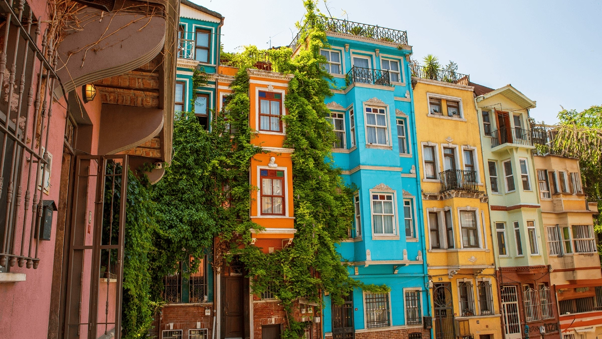
4. Balat, Istanbul, Turkey (70.94/100)
Dominant colours: Weathered Pink, Faded Yellow, Muted Green, Patinated Blue, Soft Coral
Balat’s softly faded colours create a gentle, nostalgic atmosphere that invites you to slow down and take in the details. The palette of muted yellows, greens, and rose colours gives the neighbourhood a sense of quiet charm, while brighter hues like turquoise and orange add occasional bursts of energy. In colour psychology, softer colours like these can have a calming effect, helping to reduce visual noise and create a sense of ease. The variation in colour from one house to the next adds just enough interest to keep the environment engaging, without feeling overwhelming. It is this balance that gives Balat its warm and welcoming feel.
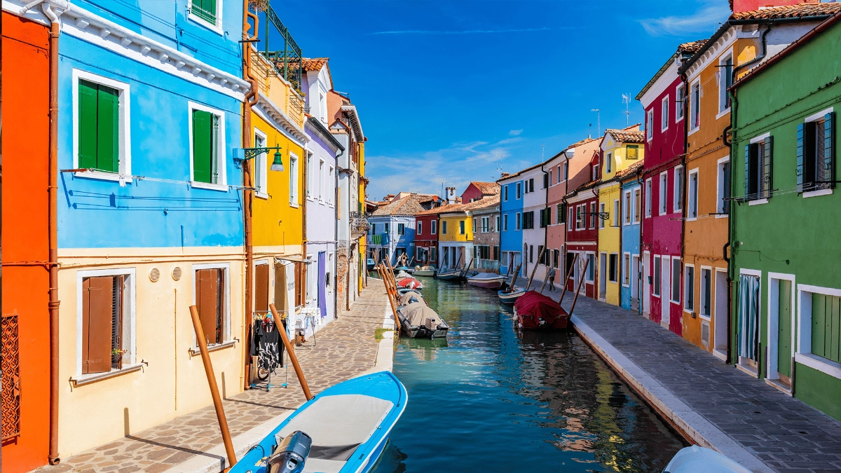
5. Burano, Venice, Italy (70.42/100)
Dominant colours: Electric Blue, Vibrant Red, Sunshine Yellow, Emerald Green, Hot Pink
Burano, a small island in the Venetian Lagoon, is world-famous for its rows of brightly painted houses that line the canals like a patchwork of colour. From vibrant pinks and reds to sunny yellows and bright turquoise, every home adds to a street scene bursting with personality. Local legend says the colours were originally chosen so fishermen could spot their houses from the water through the fog.
Today, the tradition is carefully preserved, with the local council regulating which colours can be used to maintain the island’s distinctive look. In colour psychology, bold and varied colours like these can energise the senses and spark feelings of delight and curiosity. The sheer intensity and variety make Burano visually unforgettable, creating a joyful atmosphere that stays with visitors long after they’ve left.
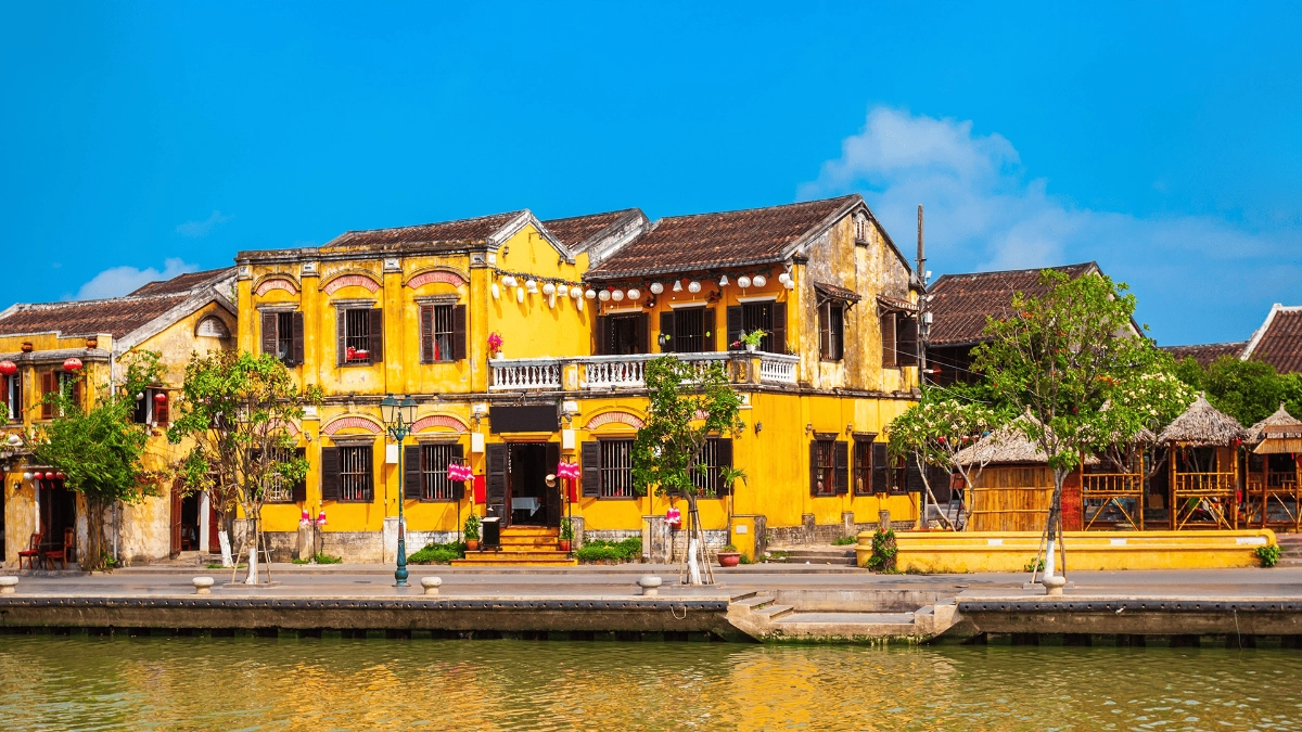
6. Hoi An, Vietnam (68.56/100)
Dominant colours: Golden Yellow, Amber, Ochre, Warm Orange, Lantern Red
Hoi An’s golden buildings and warm lantern light create an atmosphere that feels welcoming and full of character. The rich yellow walls are more than just beautiful. In Vietnamese and wider East Asian culture, yellow has long been associated with royalty, wealth and power. In colour psychology, warm yellows like these are known to evoke feelings of happiness and optimism.
As evening falls, the glow of colourful silk lanterns brings a sense of celebration, inviting people to slow down, connect and take in their surroundings. It is this combination of cultural richness, vivid colour and light that gives Hoi An its unforgettable charm.
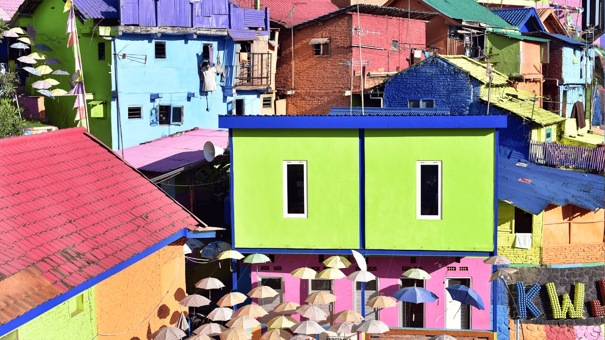
7. Kampung Pelangi, Indonesia (68.16/100)
Dominant colours: Rainbow Spectrum - Red, Orange, Yellow, Green, Blue, Indigo, Violet
Kampung Pelangi, known affectionately as ‘The Rainbow Village’, offers a full spectrum of colour across rooftops, walls and walkways. The makeover involved painting over 200 homes, each in at least three bright colours, transforming a once neglected neighbourhood into a lively, rainbow-themed destination. This burst of colour brings a renewed sense of vibrancy to the area and is often seen as a source of pride and positivity for the local community. It also draws visitors in, turning the village into a place that is not only seen, but shared and celebrated.
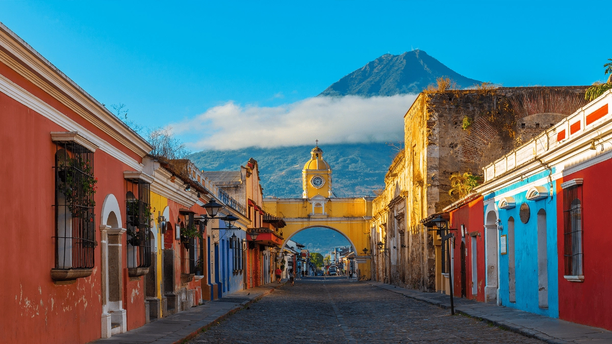
8. Antigua, Guatemala (67.25/100)
Dominant colours: Warm Terracotta, Sunny Yellow, Deep Burgundy, Coral Pink, Burnt Orange
Antigua’s warm, earthy colours create an atmosphere that feels both inviting and grounded. The terracotta and burnt orange tones echo the surrounding volcanic landscape, giving the town a strong sense of place. In colour psychology, these warm hues are known to evoke feelings of warmth, friendliness and welcome.
Together they create an environment that encourages visitors to slow down, take notice and engage more deeply with the cultural experience around them. I know this from experience — I’ve been there and felt it for myself.
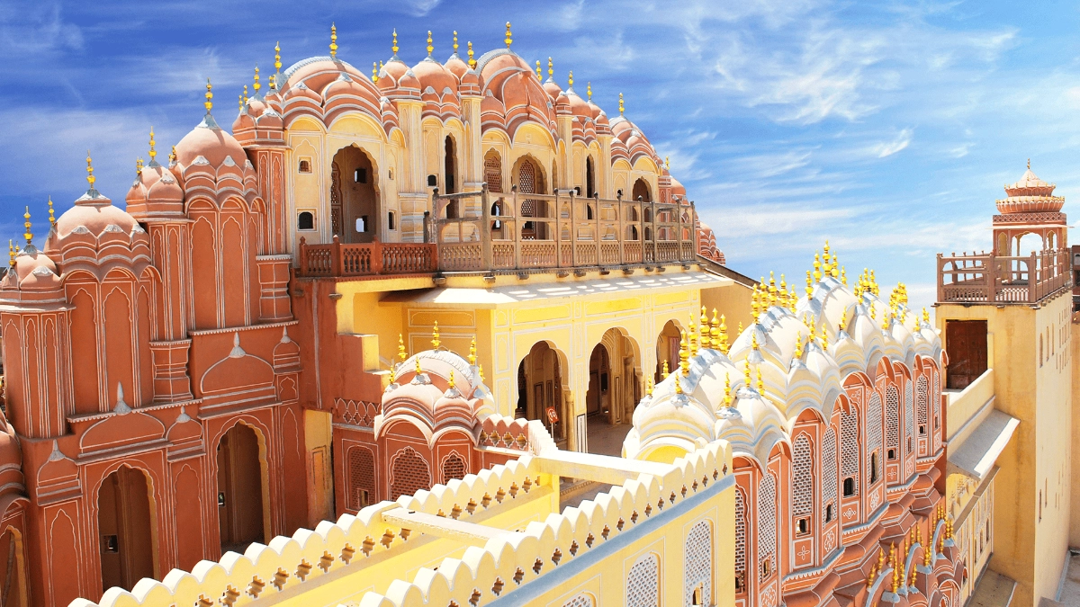
9. Jaipur, India (66.90/100)
Dominant colours: Rose Pink, Salmon Pink, Dusty Pink, Terracotta
The soft terracotta pink tones of Jaipur’s famous buildings create a sense of warmth and welcome that has become part of the city’s identity. Often referred to as the Pink City, Jaipur was painted this colour to impress visiting royalty, and the tradition has been carefully maintained ever since. In colour psychology, soft pinks are associated with gentleness, compassion and kindness.
Amid the fast pace of city life, this warm wash of colour offers a sense of ease and encourages you to slow down. Something I noticed immediately when I visited.
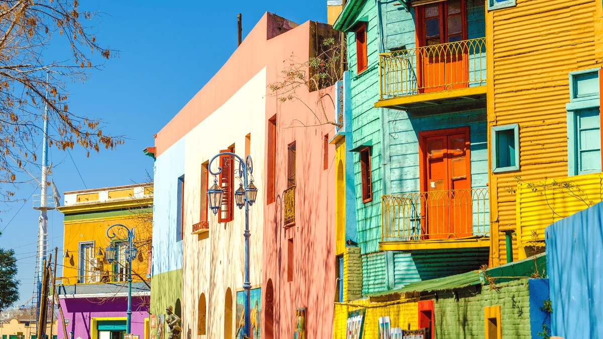
10. La Boca, Buenos Aires, Argentina (66.52/100)
Dominant colours: Cobalt Blue, Fire Red, Bright Yellow, Kelly Green, White Accents
La Boca’s bold, high-contrast palette creates an atmosphere full of energy and vibrancy. With deep blues, fire reds and bright yellows painted across buildings, shutters and balconies, the visual experience is immediate and intense. In colour psychology, strong contrasts and saturated hues like these are known to stimulate the senses and evoke feelings of excitement and liveliness. The colours reflect the passion and expressive spirit of the neighbourhood, echoing the music, dance and cultural energy that define this corner of Buenos Aires.
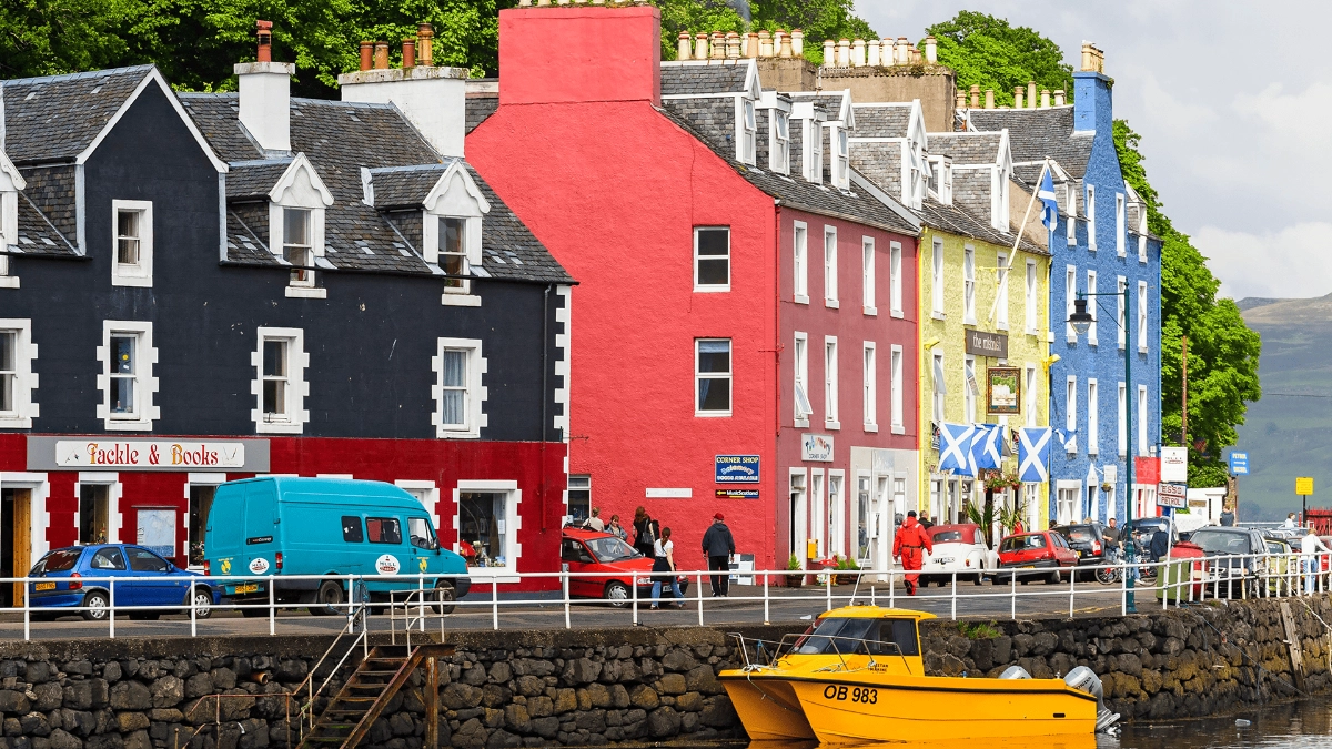
11. Tobermory, Scotland (65.06/100)
Dominant colours: Bright Red, Warm Orange, Sunshine Yellow, Ocean Blue, White Trim
Tobermory’s cheerful waterfront houses bring a burst of colour to Scotland’s west coast, creating a sense of warmth and welcome even on the coldest days. Brightly painted houses made it easier for fishermen to spot their homes and local businesses from the harbour or while out at sea, especially in misty or overcast weather.
Painted in strong red, yellow, blue and black, the buildings have become iconic alongside the harbourfront and even served as the filming location for the television series Balamory. Many guidebooks and travel resources describe them as adding notable cheer to the town during its long, grey winters.
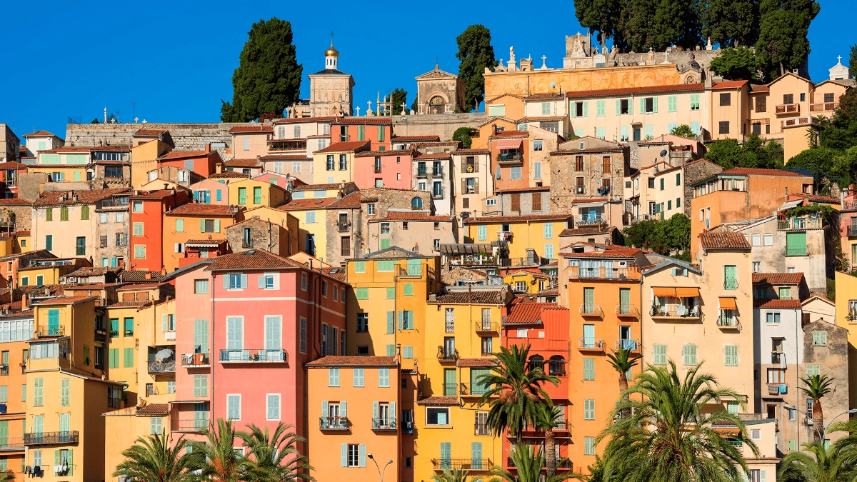
12. Menton, France (64.87/100)
Dominant colours: Soft Peach, Pale Yellow, Muted Pink, Gentle Coral, Subtle Blue
Menton’s buildings are painted in softly faded earthy tones such as warm pinks, ochres, pale yellows and gentle russets, reflecting its Mediterranean heritage where local materials like limewash and natural pigments were chosen for their availability and suitability to the coastal climate.
Menton’s mild microclimate, coastal setting and sheltered location have attracted visitors for over a century, particularly during the 19th century when the town became known as a winter health retreat. Combined with its sea air, abundant sunlight and slower pace of life, Menton came to be associated with convalescence and the pursuit of wellbeing. It’s a place I keep returning to drawn by the colour, the light and the simplicity of life there.
13. Portmeirion, Wales (64.16/100)
Dominant colours: Whimsical Pink, Mediterranean Blue, Playful Yellow, Cream White, Sage Green
Portmeirion’s bold and unexpected colour combinations create a striking visual experience that feels imaginative and uplifting. Designed by architect Clough Williams-Ellis in the mid-20th century, Portmeirion was intended as a celebration of beauty, escapism and architectural harmony.
Inspired by Mediterranean villages, its brightly painted buildings in turquoise, coral, ochre and soft greens stand out against the natural Welsh landscape. The playful use of colour and form invites curiosity and makes you want to explore, wander and see what’s around the next corner.
14. Valparaíso, Chile (62.09/100)
Dominant colours: Bold Red, Electric Blue, Bright Yellow
Valparaíso’s ever-changing street art creates a vibrant, high-energy visual experience that makes the city feel alive at every turn. Painted across buildings, staircases and alleyways, the bold colours and expressive styles bring constant movement and surprise to the streets. The walls are layered with colour, text and imagery that shift from one building to the next, giving the city a raw, creative energy. The steep hillside layout adds to the sense of rhythm and unpredictability, offering a new perspective with every step.
Being in Valparaíso can feel energising and unpredictable, as if the city itself is in motion. The colours pull you in, the street art makes you stop and look, and the constant changes keep you alert and curious.
15. Júzcar, Malaga, Spain (61.63/100)
Dominant colours: Smurf Blue, Sky Blue, Azure Blue, Blue Monochrome
Júzcar’s transformation into a completely blue village is visually striking and unlike anything else in the region. Tucked into the green Andalusian mountains, the bright blue buildings stand out sharply against the natural surroundings. Originally painted as part of a film promotion, the colour took hold and became the town’s new identity after residents voted to keep it.
Walking through Júzcar can feel surreal or otherworldly, with the intense use of blue creating a strong sense of visual uniformity. Rather than blending in, the colour makes the village feel like it has been placed within the landscape rather than growing from it — a reminder of how colour can completely change the character of a place.
Don’t forget to protect your next colourful vacation
Even the most colour-packed holidays can encounter mishaps so ensure you financially protect yourself and your holiday investment with tailored travel insurance. It’s your safety net for the unexpected, not just when you land, but from the moment you book. Whether it’s delays, cancellations, or medical issues, being covered means you can relax with loved ones, knowing you’re protected.
Choose a policy that suits your travel plans, like worldwide travel insurance, and if you’re unsure about anything, the Staysure team is here to help.
Methodology
Starting with a selection of ‘most colourful places’ lists, we conducted an objective analysis to determine which destinations truly deserve the top rankings.
The ‘ChromaTravel’ Index
We developed the index to score destinations from 0-100 based on three key attributes:
-
Colour saturation: The intensity of colours
-
Colour vibrancy: The brightness of the colour palette
-
Hue variation: The diversity of colours present
Unbiased image selection
We ensured objectivity by:
-
The 15 images per town/city destination were gathered from multiple sources (Google Street View, Instagram location tags, TripAdvisor).
-
Strict selection criteria were applied (only daylight photos, no filters, minimum resolution requirements).
-
A blind selection process was used where researchers chose the first qualifying images without knowing which would score higher.
-
Different areas of each destination were included for comprehensive representation.
Analysis process and expert validation
Specialised image processing software analysed each image, calculating scores for saturation, vibrancy, and hue variation. These were combined into a single ‘ChromaTravel Index’ score, with destination rankings based on the average across all 15 images.
Our methodology and findings were reviewed by Karen Haller, a leading expert in colour psychology, who provided insights into how these colourful environments influence traveller experiences and emotional wellbeing.
Karen Haller, renowned colour psychologist, concludes: "Vibrant, colourful environments can profoundly impact our psychological wellbeing and more travellers are becoming interested in these benefits. These visually rich destinations can boost mood, inspire creativity, and create more memorable travel experiences."